
✍️ Introduction
Exploratory Data Analysis (EDA) is the essential first step in the data science pipeline. It is a crucial process performed before any complex statistical modeling or machine learning is attempted.
Think of EDA as a data detective’s preliminary investigation—you must analyze the crime scene, gather clues, and establish the facts before forming a theory. Similarly, like a cook must analyze the recipe and prepare ingredients before cooking, a data scientist must perform an initial, deep analysis of the dataset to understand its nature and determine the best approach for subsequent modeling steps.
During EDA, we primarily leverage data visualization tools and basic statistical summaries to gain a profound understanding of the data we’re working with. Our goals are to discover the data’s main characteristics, understand its structure, and gather critical information about its quality and readiness for modeling.
The Main Goals of EDA
Performing a thorough EDA achieves several vital objectives:
- Data Quality Assessment: It helps identify and make informed decisions about missing data (e.g., whether to use imputation techniques or remove rows/columns) and detect outliers or data errors.
- Feature Engineering Foundation: It provides the necessary insight to make decisions about creating new features that might better describe the underlying phenomenon and be more useful for machine learning models.
- Deep Data Understanding: It helps the analyst better understand the distribution and relationships between variables, which streamlines the entire data preparation process.
- Label and Model Selection: It aids in understanding the target variable (the labels, if available)—for example, by revealing data distribution—which is crucial for selecting and planning the appropriate machine learning model.
- Time and Resource Estimation: It helps to more accurately estimate the time and effort required for feature engineering, cleaning, and model training.
- Handling Imbalance: It helps detect data imbalance (where one class significantly outweighs others) and informs decisions on correction techniques, if necessary.
- Data Scope Decisions: It assists in making decisions regarding the reduction or expansion of the dataset (e.g., if there is insufficient or poorly distributed valuable data).
🛠️ EDA Techniques: Your Data Toolkit
1. Initial Data Inspection & Setup
The first step in any analysis is ensuring your data is loaded correctly. This is often an overlooked yet crucial step.
- File Format and Read Integrity: Confirm the dataset file (e.g., CSV, JSON) is read properly and that all rows and columns were parsed as intended.
- Headers and Structure: Verify that column names (headers) are present and correctly mapped to the data. Sometimes external files or manual input are required to label features accurately.
- Tooling: Once basic checks are complete, we use powerful libraries like Pandas in Python to begin the heavy lifting.
2. Summary Statistics (Univariate Analysis)
Summary statistics provide a numerical snapshot of your dataset’s structure and contents.
- Dataset Structure: We first determine the overall size (rows and columns) and inspect the data types of each feature (e.g., numerical, categorical, date/time). This knowledge dictates the appropriate analytical approach for each column.
Key Metrics by Data Type
- Numerical Data: Metrics like mean (average), median (midpoint), mode (most frequent), standard deviation (spread), min/max, and quartiles (25th, 50th, 75th) reveal central tendency and dispersion.
- Categorical Data: We use counts, frequencies, and proportions to understand how categories are distributed.
- Time-Related Data: Special checks for seasonality and trends are performed.
Data Quality Checks
- Duplicates: Identifying and managing duplicate rows is essential. Duplicates can skew statistics, waste computational time, or lead to data leakage (where the same record appears in both training and test sets).
- Missing Data: Finding the extent and location of missing values is critical for deciding on subsequent cleaning steps, such as imputation or removal.
3. Data Visualization
Visualization is where patterns and anomalies truly jump out. While advanced techniques exist, a few foundational plots are used in almost every EDA.
📈 Univariate Plots (Analyzing One Variable)
- Histograms: These plots display the distribution of numerical data. They allow us to visually determine the shape of the data, including how skewed (asymmetrical) it is (left-skewed, right-skewed, or normally distributed).
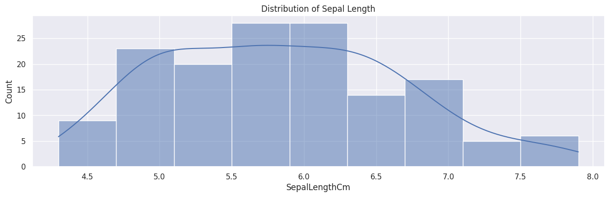 Figure 1. Example of a histogram plot.
- Box Plots: Also known as box-and-whisker plots, they visually summarize the five-number summary: median, 1st quartile, 3rd quartile, and the min/max range. They are the primary tool for visually identifying outliers.
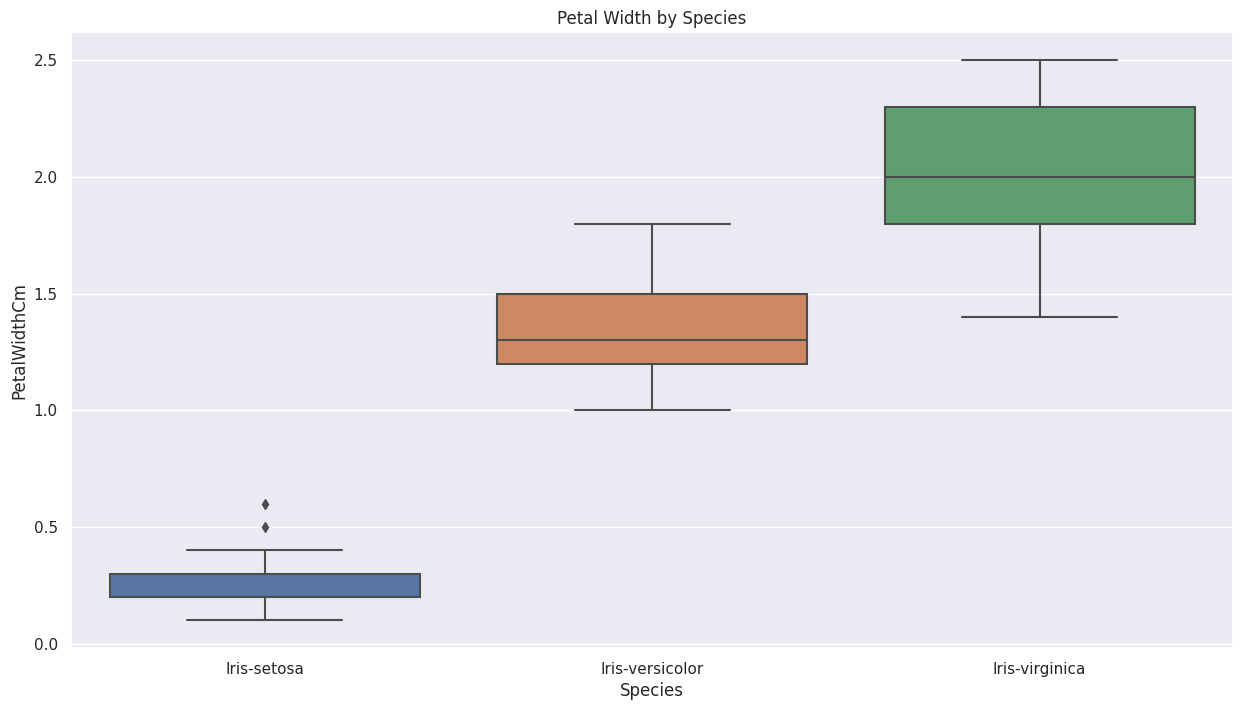 Figure 2. Example of a box plot.
- Bar Charts: Used for categorical data, bar charts show the frequency or counts of each category. They are essential for quickly assessing the balance or imbalance of the dataset, especially for the target variable (labels).
🔗 Bivariate/Multivariate Plots
-
Scatter Plots: This is the go-to plot for exploring the relationship or correlation between two numerical variables. They are often used to see how strongly a feature relates to the target label (if the label is numerical), providing a preliminary gauge of that feature’s predictive utility.
-
Heatmaps: These are primarily used to visualize the correlation matrix between multiple numerical features. A correlation matrix gives a numerical value (from –1 to 1) indicating the linear relationship.
- Correlation Types: The Pearson correlation coefficient is the standard measure for linear relationships (though it can be sensitive to outliers).
- Interpretation: Correlations closer to 1 (strong positive relationship) or –1 (strong negative relationship) are considered high. Knowing which features are highly correlated with the target label, and which features are highly correlated with each other (potential multicollinearity), is vital for feature selection.
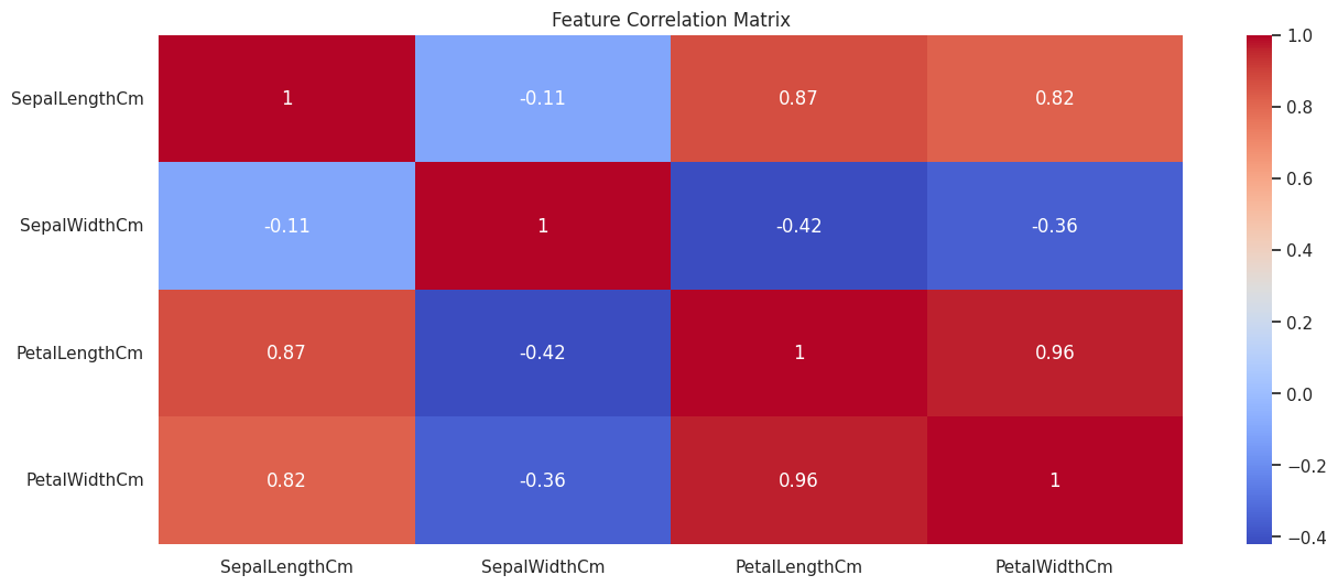 Figure 3. Example of a correlation heatmap.
🚀 A Simple EDA Workflow
To demonstrate the EDA process, we’ll use Python with the Pandas library for data handling, NumPy for numerical operations, and Matplotlib and Seaborn for powerful visualization.
1. Setup and Data Loading
First, we import the necessary libraries and load a standard dataset, the Iris Dataset, which is conveniently available through the Seaborn package.
|
|
2. Initial Data Inspection
We begin by getting a quick feel for the data’s structure.
🔍 Checking Head, Tail, and Shape
We check the first and last few rows to visually inspect the data and confirm the total dimensions.
|
|
💡 Data Types and Non-Null Counts
The df.info() method is vital, as it shows the data type (dtype) of each column and, crucially, a quick summary of non-null counts, helping us immediately spot potential missing data issues.
|
|
3. Summary Statistics (Univariate Analysis)
Next, we calculate descriptive statistics to understand the central tendency, spread, and distribution of each feature.
📊 Descriptive Statistics
The df.describe() function provides a statistical summary. By default, it runs only on numerical features, showing the count, mean, standard deviation, min/max, and quartiles.
|
|
🏷️ Analyzing the Target Variable (Labels)
For supervised learning datasets like Iris, we examine the distribution of the target variable, which is often crucial for assessing class balance.
|
|
💔 Checking for Missing Data
We check for missing data to decide on our cleaning strategy. Calculating the count of missing values per column is the first step.
|
|
Note: In a real-world scenario, you would calculate the percentage of missing data (i.e., df.isnull().sum() / len(df) * 100) as this gives more meaningful context for imputation or removal decisions.
4. Data Visualization
Visualization transforms raw numbers into easily digestible insights.
📉 Univariate Plots
These plots help us understand the distribution of single features.
• Histogram
Shows the frequency distribution of a numerical variable (sepal_length).
The parameter kde=True adds a smooth line representing the probability density function.
|
|
• Box Plot
Identifies the median, quartiles, and is the best tool for spotting outliers.
|
|
🔗 Bivariate/Multivariate Plots
These plots explore the relationships between features.
• Scatter Plot
Used to visualize the relationship between two numerical variables.
By using hue='species', we introduce a third, categorical variable, making it a multivariate plot.
|
|
• Correlation Heatmap
Visualizes the strength of the linear relationships between all numerical features. The color gradient helps identify highly correlated pairs quickly.
|
|
🏁 Conclusion
In this post, we covered the fundamental techniques of Exploratory Data Analysis (EDA), ranging from basic summary statistics to the interpretation of correlation heatmaps.
As demonstrated, you can gain profound insights from these simple analytical steps. EDA is crucial for building robust and accurate machine learning models. The old programming adage, “Garbage In, Garbage Out (GIGO)”, perfectly applies here: EDA allows us to identify potential “garbage” (errors, inconsistencies, and severe imbalances) in the dataset before we commit to complex and time-consuming modeling efforts.
Your Next Steps: Practice Makes Perfect
While we used a very standard dataset, the best way to solidify your learning is to perform the EDA yourself. I encourage you to follow the steps outlined above on this or a similar public dataset.
The best platform to practice and share your data science journey is Kaggle. Once you publish your analytical notebook, you can receive valuable feedback from the community of “Kagglers,” which will significantly help you improve your skills.
- Try the Iris Dataset: https://www.kaggle.com/datasets/uciml/iris
- Challenge Yourself with the Titanic Dataset: https://www.kaggle.com/competitions/titanic
Happy analyzing!